Ctrl + P → Save as PDF · Landscape · Margins: None · Scale 100%
Lyra AIBrand book
Version 1 · May 2026
The visual & verbal system
Lyra

Cream, prism, and quiet authority.

One book. Everything our team, our designers, and our partners need to make Lyra AI feel like Lyra AI — across product, social, decks and print.

Stewarded by Stephany Oliveros & Maja Ribó
01 / 26
Lyra AIBrand book v1
Contents02 / 26
Contents

What's inside this book.

Twenty-six slides. Built to scan in a meeting and to anchor decisions for years. Open in browser, export to PDF with Ctrl + P (landscape, no margins), then drop straight into PowerPoint or Google Slides.

Foundations
  • 03Brand essence
  • 04Four pillars
  • 05Promise & audience
Identity
  • 06Logo
  • 07Logo — variants & don'ts
  • 08Color palette
  • 09Color origin
  • 10Color — 60 / 30 / 10
  • 11Color — pairing rules
  • 12Sample compositions
Typography & feel
  • 13Typography — families
  • 14Typography — scale
  • 15Photography direction
  • 16Materials & texture
Voice
  • 17Voice — principles
  • 18Words — use & avoid
Communication
  • 19Communication guide
  • 20Content pillars
  • 21Format mix & cadence
  • 22Reference — Female Invest
  • 23Reference — MasterClass
  • 24Reference — EarthRise
  • 25Reference — Foundr & Perplexity
Stewards
  • 26Stewards & sign-off
Lyra AIBrand book v1
Brand essence03 / 26
The essence

A career engine that women can finally trust.

Lyra AI matches women to the right work, in the open. The algorithm is auditable, the criteria are visible, and the path to a better match is something you do — not something you wait for.

We are editorial, not corporate. Tender, not loud. Specific, not aspirational. The brand should feel like a thoughtful magazine that happens to run on technology.

We are
honest, editorial, iridescent, quiet
We are not
techy, hyped, neon, corporate
We sound
specific & generous
We feel
cream paper + prism light
Lyra AIBrand book v1
Four pillars04 / 26
Four pillars

The four words every decision answers to.

01
Honest.
Every score, every rejection, every match reason is auditable. Transparency is a product feature, not a marketing claim.
02
Editorial.
We compose like a magazine: serif headlines, generous space, deliberate photography. Information is luxury when it's well-arranged.
03
Iridescent.
Color comes from agate, opal and prismatic light — not flat gradients. Soft pinks, blues, golds caught in glass.
04
Quiet.
We don't shout. Confidence is whitespace, restraint, and one good sentence. Volume signals insecurity.
Lyra AIBrand book v1
Promise & audience05 / 26
The promise

Be matched to work that fits you. See exactly why.

We make career matching legible. Score, criteria, gaps, and the next skill to close — all open, all explained, all yours.

One sentence. Read out loud before any campaign.
She is
25–42, mid-career, often pivoting. She has tried generic job platforms and didn't trust the results. She doesn't want hype, she wants evidence — and a door that opens because she opened it.
Reads
The Cut, MR Porter, Substack essays
Watches
Long-form interviews, not 15-sec tips
Trusts
Numbers + lived experience
Disqualifies
Pink-washing, vague AI hype
Lyra AIBrand book v1
Logo06 / 26
The wordmark

Instrument Serif italic. One ash star. Nothing else.

The mark is the word "Lyra" set in Instrument Serif italic with a four-pointed star (✦) at the upper-right. The star is rendered in ash black with three layered shadows — a whisper of highlight, a soft cast, and a faint glow — so it reads as a small object catching light rather than a flat shape.

Glyph
U+2726 · ✦
Word tracking
−0.02 em
Star size
0.38–0.55 em of the word
Lyra
LyraAI
LyraAI
Lyra AIBrand book v1
Logo — variants & don'ts07 / 26
Approved variants
LyraInk on cream
LyraCream on void
LyraAIWith "AI" suffix
LyraOn prism — proceed with care
Don't
  • 01Stretch, condense or italicise further. Instrument Serif is already italic.
  • 02Recolour the star pink, purple or gradient. It is ash black, always.
  • 03Place the wordmark over busy photography without a tonal scrim.
  • 04Replace the ✦ with another star glyph (★, ☆, ✧). It must be U+2726.
  • 05Use it smaller than 14px. The shadows collapse and the letter shape thins.
  • 06Add taglines under the logo. Pair it with a separate headline if needed.
Lyra AIBrand book v1
Color palette08 / 26
Palette

Six colors. Pulled from agate, opal and prism.

CreamBase · paper#F4F1EB
InkType · contrast#1A1A1A
Agate RoseAccent · warmth#E4B8C9
Opal SkyAccent · cool#B8B5D8
Apricot MineralAccent · earth#E8B89C
VoidInverse base#0E0C0A
Print
Cream prints best on uncoated stock 120–180 gsm
Digital
Cream #F4F1EB · Ink #1A1A1A · WCAG AA on body copy
Restraint
Use one accent per layout — never all three
Lyra AIBrand book v1
Color origin09 / 26
Where it comes from

Extracted from mineral, not picked from a wheel.

Every accent in the palette was sampled from imagery we love — slices of agate, the inside of an opal, prismatic film on glass, late afternoon light through a window. That's why the palette feels like a found object, not a brand template.

When adding a new accent, sample it from a photograph and check it against cream and ink before approving. If it can't live next to the others without one shouting, it doesn't belong in the palette.

Agate · banded rose
Sampled at the seam
Opal · cool flash
Inner refraction
Mineral · apricot
Sunlit surface
Void · obsidian
Light at rest
Lyra AIBrand book v1
Color — 60 / 30 / 1010 / 26
Distribution

The 60 / 30 / 10 rule keeps us composed.

60% · Base
Cream paper
Backgrounds, large surfaces, breathing room. Cream is what people remember.
30% · Contrast
Ink & void
Type, deep sections, the dark sibling that gives the cream its weight.
10%
Prism
Read left to right — that's roughly the visual weight of any well-made Lyra layout.
Lyra AIBrand book v1
Color — pairing rules11 / 26
Pairing

Pairings we approve. Ratios we audit.

Every approved pairing meets WCAG AA on body text. The accent colors are never used for type smaller than 14px. If a layout needs an accent for type, set it on cream and use ink for the words.

Lyra AI
#1A1A1A / #F4F1EBHeadlines · body · UIWCAG AAA
Lyra AI
#1A1A1A / #E4B8C9Accent cards · quotesWCAG AA
Lyra AI
#1A1A1A / #B8B5D8Accent cards · quotesWCAG AA
Lyra AI
#1A1A1A / #E8B89CAccent cards · quotesWCAG AA
Lyra AI
#F4F1EB / #0E0C0AInverse sectionsWCAG AAA
Lyra AI
#F4F1EB / #1A1A1AInverse typeWCAG AAA
Lyra AIBrand book v1
Sample compositions12 / 26
Compositions

Three layouts you can re-use forever.

A · Editorial cover
Lyra
A career engine women can finally trust.
Cream · ink · one accent corner
B · Quote card
"I finally know why I keep being matched to roles that aren't a fit."
Beta candidate · March 2026
C · Void announcement
In beta
Match. See why. Close the gap.
Wait-list now → lyra.ai
Lyra AIBrand book v1
Typography — families13 / 26
Display
Aa
Instrument Serif · italic · variable

The voice of the brand. Used for headlines, pull-quotes, and any moment that should feel composed and human. Italic only — the upright cut feels editorial in a colder way than we want.

Body
Aa
Inter · regular & medium

The everywhere font. Body copy, UI, captions, micro-labels. Inter holds composure at every weight and pairs cleanly under Instrument Serif without competing.

Lyra AIBrand book v1
Typography — scale14 / 26
Scale

One scale. Used everywhere.

The scale is calm because we don't deviate. If a layout needs a size that isn't in the scale, find the closest match instead of inventing a new one.

Display 1
Match. See why. Close the gap.
76px · Slide hero · landing hero
Display 2
Match. See why. Close the gap.
56px · Section headline
Display 3
Match. See why. Close the gap.
40px · Card title · pillar name
Lead
Match. See why. Close the gap.
22px · Hero subhead · pull-quote
Body
Match. See why. Close the gap.
16px · Default paragraph
Caption
Match. See why. Close the gap.
13px · Footnote · table cell
Eyebrow
Match. See why. Close the gap.
10px · Uppercase · 0.4em tracking
Lyra AIBrand book v1
Photography direction15 / 26
Photography

People at rest. Materials up close.

  • Soft, north-facing window light. No hard flash, no studio ring.
  • Subjects mid-thought, not mid-laugh. Eyes can be off-camera.
  • Cream, sand, plaster, paper, glass. Backgrounds are textures, not sets.
  • Skin tones honest — colour-correct on screens, don't oversmooth or lift.
  • Aspect ratios 3:4 and 4:5 for portraits; 16:9 only for environment shots.
We are women shot the way they want to be seen — not the way stock photography sees them.
Portrait · 3:4
Window light · paper backdrop
Object · 1:1
Mineral · glass · cream
Environment · 16:9
Studio in soft afternoon
Detail · 4:5
Hands · paper · pen
Lyra AIBrand book v1
Materials & texture16 / 26
Materials

What it feels like to hold the brand.

Cream paper
Uncoated · 180gsm
Prism glass
Backlit · soft
Obsidian
Matte black · light at rest
Mineral grain
Sanded · warm
Backdrop
Always cream or void. Never pure white. Never grey.
Surface
Mineral, paper, glass — anything that catches light softly.
Forbidden
Plastic, neon, chrome, holographic foil, stock gradients.
Lyra AIBrand book v1
Voice — principles17 / 26
Voice

How we sound out loud.

01
Specific beats aspirational.
Name the role, the score, the gap. Don't promise transformation — show the next move.
02
Evidence beats assertion.
If we say the algorithm is fair, we cite how. If we cite a number, we link the source.
03
Tender beats neutral.
We are writing to real women with real careers. Warmth is not optional — but warmth is not pink either.
04
Short sentences. Short paragraphs. Period.
Confidence is the willingness to stop. Most of our sentences could lose a clause.
Lyra AIBrand book v1
Words — use & avoid18 / 26
Use
Matchwhat the algorithm produces
Fitthe human reading of the match
Gapthe visible distance to a higher score
Close the gapthe verb of upskilling on Lyra
Auditableanyone can inspect the math
Field noteswhat we share — not 'content'
Avoid
Empower / empowermentlazy shorthand · over-claimed
Revolutionary / disruptwe don't disrupt — we clarify
Game-changing / 10x / next-gentech-bro register
Boss babe / girlboss / queenpatronising · era over
AI-poweredsay what it does, not how it runs
Just / simply / easyyou don't know how easy it is for her
Lyra AIBrand book v1
Communication guide19 / 26
Communication guide

What our feed should look, sound and feel like.

People should recognise us before they read the handle. The next seven slides give the team — and any creator we work with — a single source of truth for content pillars, formats, cadence, and the references we study.

Three questions are asked of every post before it ships: Does it look like Lyra? Does it sound like Lyra? Would our reader screenshot it?

Look
Does it look like Lyra?
Cream or void background. Instrument Serif italic in the headline. One accent maximum. Photography honest, not stock.
Sound
Does it sound like Lyra?
One clear sentence. Specific number or fact. No empowerment language. No exclamation marks.
Feel
Would our reader screenshot it?
Does it tell her something true, useful, or a little surprising? If it's only nice — it's not enough.
Lyra AIBrand book v1
Content pillars20 / 26
Pillars

Five things we post about. Nothing else.

0130%
Show the math
Explainers on how the matching engine actually works. Score breakdowns, criteria, weights. Anti-black-box.
"How a 73% match becomes an 81% in two weeks."
0220%
Industry truth
Honest data about women, careers, AI, hiring. Cite the source on the post itself.
"Why women apply when they meet 100% of criteria — and the cost."
0325%
Founder field notes
From Stephany & Maja. Building in public, decisions, mistakes, what we learned this week.
"We rejected our first VC term sheet. Here's why."
0415%
Skill closing
Micro-lessons tied to a real role on Lyra. Five-minute AI literacy. Tied to a clickable gap-close action.
"The 6 AI workflows every PM should run before Q3."
0510%
Quiet wins
Candidate stories told without spectacle. First name, first match, what changed. With consent.
"Lucía went from 41% to her first match in 9 days."
Mix targets are weekly averages — not a quota. Reshuffle when the week needs it.
Lyra AIBrand book v1
Format mix & cadence21 / 26
Formats

Six formats, six cadences, one editorial calendar.

FormatCadenceWhat it doesSpec
Carousel
2× / week
Teach the math. Walk through a score, a gap, a fix.
8–10 slides · cream or void · Instrument Serif on slide 1, Inter inside
Single post
2× / week
One sentence + one image. Quote cards. Stats with source.
1:1 or 4:5 · cream paper · one accent max · attribution bottom-left
Reel
2× / week
Founder field notes. 30–60s. Soft cuts. No on-screen captions unless quoting.
9:16 · soft window light · serif lower-third only · always captioned for accessibility
Story
Daily
Behind the scenes. Polls. Build-in-public diary. Short and ephemeral.
Native fonts ok · cream sticker palette · max 3 frames per topic
Long-form
1× / month
Substack essay or LinkedIn deep-dive. The position pieces.
1200–1800 words · sourced · pull-quote in Instrument Serif
Live
1× / month
Office hours. Q&A with a beta candidate. Conversation, not pitch.
30 min · scheduled 7 days ahead · recap reel within 48h
Lyra AIBrand book v1
Reference — Female Invest22 / 26
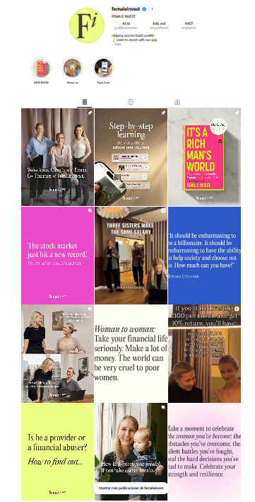
Female Invest Instagram grid
Reference account
Female Invest
@femaleinvest · finance education for women
We borrow
Bold headline cards anchored to a single number or claim. Confident editorial voice that respects the reader's intelligence. Topics ladder from beginner to advanced without dumbing down.
We don't copy
Heavy neon palettes, party-finance energy, and headline density that feels like a textbook. Their bright pink saturation reads younger than our reader.
Insight for Lyra
Treat every carousel as a teach-in. Lead with a number or a counter-intuitive claim on slide 1. Carry one editorial colour through the whole carousel — never switch palettes mid-set.
Lyra AIBrand book v1
Reference — MasterClass23 / 26
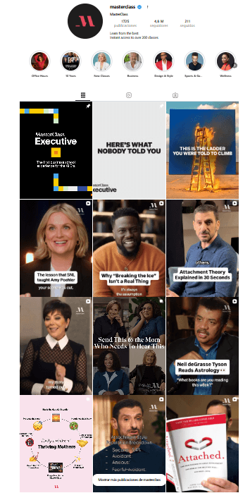
MasterClass Instagram grid
Reference account
MasterClass
@masterclass · cinematic expert tuition
We borrow
Cinematic portraits with rich shadow. The person's name in restrained serif type. The promise of access to a specific expert's mind. Every post says: 'here is a real human worth listening to'.
We don't copy
Celebrity gravitational pull — we are not selling the famous person, we are showing our reader. Pure black backgrounds risk feeling cold; we soften to cream or void.
Insight for Lyra
When we feature founders, candidates or experts, shoot them like MasterClass: directional light, considered crop, name in serif, no on-image marketing. Let the portrait do the work.
Lyra AIBrand book v1
Reference — EarthRise24 / 26
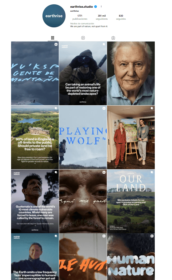
EarthRise Studio Instagram grid
Reference account
EarthRise Studio
@earthrise.studio · poster-grade editorial storytelling
We borrow
Poster-grade craft. Layouts that look like a magazine cover, not a social tile. Reverence for the subject. A serif headline doing the heavy lifting, never the caption.
We don't copy
Mission-led austerity that risks feeling pious. We share their craftsmanship — not their cause register. Lyra is generous, not earnest.
Insight for Lyra
The aesthetic ceiling we should reach toward. Every quote card and pillar piece should be designed as if it could be framed and hung. If a layout doesn't survive being printed at A3 — rework it.
Lyra AIBrand book v1
Reference — Foundr & Perplexity25 / 26
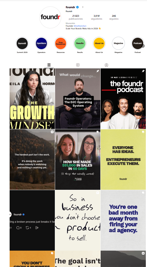
Foundr Magazine grid
Reference account
Foundr
@foundr · founder education
We borrow
Grid discipline — every tile reads as part of a series. Founder portraits with strong type lock-up. A clear visual hierarchy across the feed when you scroll back.
We don't copy
The yellow / black bro register and 'hustle' headlines. Our founder content is reflective, not heroic.
Insight for Lyra
Design the feed as a grid, not as posts. Pre-mock the next 9 tiles in a 3×3 before approving any single one.
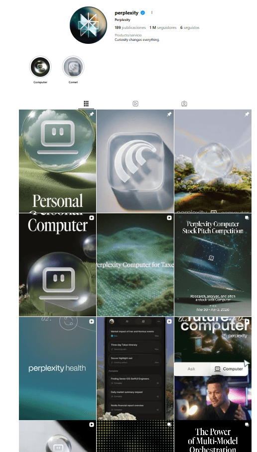
Perplexity grid
Reference account
Perplexity
@perplexity.ai · quiet tech confidence
We borrow
Restraint as authority. Dark, glossy palette used sparingly. Product is the hero, claim is short, layout is calm.
We don't copy
The all-dark feed and tech-monochrome register — we live primarily in cream, with void used for emphasis only.
Insight for Lyra
Borrow the confidence-through-restraint. When we announce something product-level, use void sparingly and let one sentence carry it.
Lyra AIBrand book v1
Stewards & sign-off26 / 26
Stewards

Who protects the brand.

Two people approve anything that goes out under the Lyra wordmark. If it doesn't pass the three checks on slide 19, it doesn't ship — even if the deadline is tonight.

Stephany Oliveros
Co-founder · product, tech, brand integrity
Maja Ribó
Co-founder · brand, partnerships, community
House rules
  • 1 · No new accent colours without a steward signing off.
  • 2 · No new fonts. Instrument Serif italic + Inter, forever.
  • 3 · No campaign without a quote, a number, or a name attached.
  • 4 · No empowerment language. No exclamation marks.
  • 5 · Every claim about the algorithm links to a public explanation.
  • 6 · This book is updated, not replaced. Versions are dated and kept.
Brand book v1 · May 2026 · hello@lyra.ai
Lyra