Lyra AI is a talent marketplace where the algorithm is on your side — and you can read it. The brand should feel the same way: luminous, exacting, and unmistakably its own.
Version
v1.1
Last updated
2026-05-09
Stewards
Stephany & Kristina
Status
Internal
01
Essence
What Lyra is for.
Lyra is a talent marketplace for women, built on a transparent matching algorithm. Every brand decision flows from one promise: the system is on your side, and you can read it.
Promise
Job matches built on what you've done. Not who you know.
The headline is the contract. Everything else — copy, palette, motion, photography — defends it.
Audience
Women ready to be seen accurately.
Sceptical of black-box hiring tools. They have receipts. They want a fair read, not a flattering one.
Adjacent feel
Form & Found meets Apollo Magazine meets a clean lab.
Editorial, but warm. Technical, but quiet. Never corporate diversity-deck.
Brand pillars
Transparent
Every score is explainable. The brand reads the same way: legible, never theatrical.
Earned
Match % rises through skill, not pitch. The visual system rewards depth over decoration.
Luminous
Light through glass, not flat colour. Prismatic, iridescent, agate — never gradient soup.
Quiet
Confidence by understatement. Wide margins, generous type, no urgency theatre.
Signature illustration: three women, prismatic interiors. The brand's visual thesis in one frame — presence, plurality, refraction.
02
Logo & mark
A four-pointed star, set in ash.
The Lyra mark is a single four-pointed star (✦) rendered in ash black with three layered shadows — a thin white highlight, a soft cast, and a faint glow. It reads as a small object catching light rather than a flat shape. The mark always sits to the upper-right of the wordmark, in italic to match it.
Lyra✦AI
Lyra✦AI
The mark, large
✦
The glyph is Unicode U+2726 set in Instrument Serif italic. Three stacked drop-shadows give it depth — a thin highlight above, a soft cast below, and a faint outline glow — so it reads dimensional without ever resorting to gradient fills.
Reference
The inspiration, not the destination. Our mark borrows the prismatic mood but distils it down to a single ash glyph. The light is implied, not painted. The restraint is the brand.
Variants
✦
Color · on cream
✦
Ink · monochrome
✦
Color · on void
✦
Cream · monochrome
Clear space
Reserve at least one star-height of clear space on every side. The shadow halo counts as part of the mark — never crop it.
Minimum size
16px digital, 14mm print. Below 14px the shadows collapse and the letter-form thins — use the wordmark without the star instead.
Lockup
Star always to the upper-right of the wordmark, offset by 0.55em above the baseline. Tracking on the word: −0.02em.
Do not
— Don't recolour the star. It is ash black on cream, cream on void. Nothing else.
— Don't outline or fill the star with a gradient. Depth comes from the shadows.
— Don't substitute another star glyph (★, ☆, ✨). It must be U+2726.
— Don't stretch, condense, or italicise further. Instrument Serif is already italic.
— Don't pair the wordmark with another serif. Instrument Serif owns the lockup.
— Don't use the mark on a busy photograph without a tonal scrim.
03
Color
Cream, ink, and light through glass.
The palette is extracted from agate cross-sections, iridescent film, and prismatic glass — never picked from a colour-wheel generator. Cream and ink are the contract; everything else is illumination.
Foundation
Cream
cream
#F4F1EB
244 · 241 · 235
Primary surface. Editorial calm. Every section starts here unless rhythm demands otherwise.
Cream deep
cream-deep
#E8E1D2
232 · 225 · 210
Section dividers, hover states, soft inset surfaces. Never main background.
Ink
ink
#1A1A1A
26 · 26 · 26
Body and display type on cream. Never pure black — the warmth matters.
Void
void
#0E0C0A
14 · 12 · 10
Dark sections. Carries prism and grain. Use sparingly, for rhythm.
Agate & mineral accents
Warm side of the palette. Use as light, not fill — behind glass, inside an orb, as a wash. Never solid blocks of these.
Agate coral
agate-coral
#C8745A
200 · 116 · 90
Heat. Anchors candidate-side surfaces. Use ≤ 15% surface area.
Agate peach
agate-peach
#E8B89C
232 · 184 · 156
Soft glow. Inside prism orbs, behind glass cards.
Mineral pink
mineral-pink
#E4B8C9
228 · 184 · 201
Selection highlight, signature wash. The colour of the brand's recognition.
One step warmer than ink. Use on void surfaces for layered depth.
Where the palette comes from
Each colour is sampled from a physical reference — agate cross-sections, iridescent film, prismatic glass. The image below the swatches is the mineral the colour was pulled from.
Agate coral
Polished coral agate, cross-section
Iridescent sky
Lapis-pink marble with gold flecks
Iridescent lilac
Refracted light through bubble film
Prism amber
Sunset prism on linen
04
Color in use
How the palette mixes.
The palette is loud only if you let it be. Dominant cream or void carries 60% of every surface. One accent carries 30%. A second accent carries 10% — never more.
Warm composition · on cream
Cream#F4F1EB60%
Mineral pink#E4B8C930%
Agate coral#C8745A10%
Candidate-side surfaces. Warm without being loud. Pink does most of the work; coral is the spark.
Cool composition · on cream
Cream#F4F1EB60%
Iridescent sky#9FB6D430%
Iridescent lilac#B8B5D810%
Employer-side surfaces. Transparency reports, audit visuals, data charts.
Night composition · on void
Void#0E0C0A60%
Iridescent lilac#B8B5D830%
Prism amber#D4A56A10%
Rhythm sections. The waitlist CTA. Anywhere the brand needs depth.
Editorial composition · on void
Void#0E0C0A60%
Cream#F4F1EB30%
Mineral pink#E4B8C910%
Pull-quote moments. Photography overlays. The most photographic of the palettes.
Working pairings · text on surface
The quick brown fox jumps over.
Body sample on this pairing.
✓ Cream + ink
16.1:1 · Default editorial pairing.
The quick brown fox jumps over.
Body sample on this pairing.
✓ Void + cream
17.4:1 · Dark rhythm sections.
The quick brown fox jumps over.
Body sample on this pairing.
✓ Cream deep + ink
13.8:1 · Inset cards, hover states.
The quick brown fox jumps over.
Body sample on this pairing.
✓ Agate coral + cream
4.9:1 · Just clears AA. Use for small CTA fills.
The quick brown fox jumps over.
Body sample on this pairing.
✕ Cream + mineral pink
1.3:1 · Decorative only. Never as type.
The quick brown fox jumps over.
Body sample on this pairing.
✕ Cream + ink at 40% alpha
2.9:1 · Fails AA. Use ink/55+ (4.2:1) for body.
Sample compositions
The same headline rendered across four palette compositions. Each works. None is louder than the message.
— Two accents per composition, maximum. Three is gradient soup.
— Warm and cool can mix, but never at equal weight.
— Mineral pink is always the lightest note. Never the loudest.
— Agate coral is the only colour that may sit beside the wordmark.
— Iridescent sky and iridescent lilac may share a composition. Pick one to lead.
— Never use a colour at 100% on more than 35% of a surface.
05
Typography
Two voices. No third.
Instrument Serif carries every display moment — headlines, pull quotes, the wordmark itself. Inter does everything else. There is no third typeface. Adding one breaks the brand.
Display · font-display
Aa
Instrument Serif Regular
High-contrast modern serif, slim italic. Loaded via next/font/google, weight 400, display: swap.
Body · font-sans
Aa
Inter Variable
Workhorse sans. Variable weights 100–900. Use 400 for body, 500 for buttons, 600 sparingly for labels.
Instrument Serif italic is the brand's whisper. Use to soften one phrase per paragraph — never two.
No third weight
If Inter 400 and 500 won't carry it, the copy needs editing, not a heavier weight.
Balance, don't justify
Use text-balance on display headings. Never full-justify body copy.
06
Photography
Warm, natural, never stock.
Lyra's photography is the antidote to corporate-diversity-deck stock. Real light, real texture, real moments. Warm tones that sit inside the cream palette — never cool blue HR-brochure light.
Hero photograph
Light, broken into its colours — that's the brand in one photograph.
Quiet labour
Hands at a laptop, late-afternoon light through linen curtains. The everyday surface of skill.
Earned optimism
Profile, smile, cream linen, coffee. The face after a good interview, not the one before.
Focus
Notebook, black silk, side-light. A woman thinking before she writes. Editorial restraint.
Contemplation
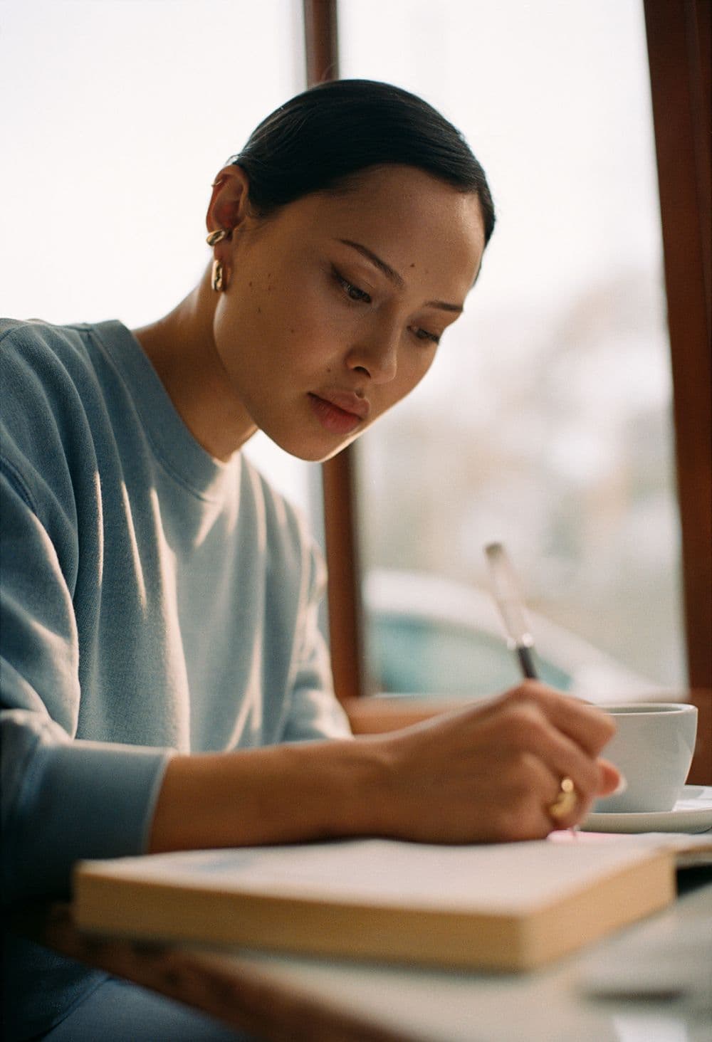
Window light, blue sweatshirt, gold ring. The interior work that match-percent doesn't capture.
Intention
Curls, mug, library-warm wood. Reflection as a professional act. Career as a craft.
Surface
Crop closer when the texture is the point. Linen, paper, hands — never face-only.
Light
Soft, golden, side-lit. Late afternoon through a window. Avoid: ring lights, flat overhead, fluorescent.
Subject
A woman mid-thought, mid-work, mid-coffee. Not posing. The camera caught her.
Texture
Linen, paper, mineral, glass. Surfaces that hold light. Hands and skin as material.
Crop
Generous. Closer to a magazine spread than a product card. Let the subject breathe.
Never
— Stock photography of women laughing at salads.
— Cold, blue, corporate HQ glass-tower shots.
— Direct eye-contact “hire me” posed portraits.
— Tokenised diversity sets that look composed.
— Filters that flatten skin or push saturation.
— Anything from a generative image model unless explicitly labelled.
07
Materials & texture
The system is made of light.
Lyra has no pattern library. Instead it has materials — prismatic film, agate cross-sections, neuron wisps. They behave like physical surfaces: blurred, layered, never sharp-edged. The references below are the actual reference images we sample from.
Iridescent prism
/textures/prism-iridescent.png
The signature surface. Soft pastel refraction — sky, lilac, cream, peach. Use as a blurred background behind glass cards, hero text, or the wordmark.
Warm prism
/textures/prism-warm.png
Sunlit version of the prism — coral, sage, cream wisps. The candidate-side counterpart to iridescent.
Mineral cross-section
/textures/mineral-blue.png
Pink-to-blue agate with gold flecks. Premium feel. Use as a hero backdrop, employer-side surface, or print cover.
Mineral coral
/textures/mineral-coral.png
Coral-edged jewel with cool centre. The richest warm material — reserve for moments that need weight.
Agate
/textures/mineral-agate.png
Cream agate with red-purple iridescent edge on black. The most refined of the minerals — works on void surfaces.
Neuron wisps
/textures/neuron-wisps.png
Luminous threads on void. The algorithm's interior. Reserved for transparency moments and the experimental concept page.
Gradient washes
When a material is too rich, drop to a wash. These are the four founder-supplied gradients used as soft atmospheric layers behind headlines and cards.
rgba(255,255,255,0.05) · blur(20px) saturate(160%) · whisper-thin highlight. Sits over void/neuron-wisps.
08
Voice & tone
Confident. Specific. Never marketing-voice.
Lyra writes like a precise older sister, not a brand. Short sentences. Concrete claims. Quiet authority. No exclamation marks, no “empowerment,” no “reimagining.”
We say
Job matches built on what you’ve done. Not who you know.
Not us
Empowering women through revolutionary AI-driven career discovery!
We say
The algorithm is on your side — and you can read it.
Not us
We’re reimagining the future of work with cutting-edge AI.
We say
Stop tailoring your CV for an algorithm you can’t see.
Not us
Say goodbye to traditional job hunting forever.
We say
Bias-audited matching out of the box.
Not us
Diversity-first hiring solutions for forward-thinking companies.
Lead with the claim
State the thing. Earn it after. Don't build up to it.
Numbers over adjectives
“87% match” beats “great match.” Always.
Short, then medium, then short
Rhythm. Read the headline aloud. Then the lead. Then the headline again.
Never urgent
No countdowns, no “limited spots,” no FOMO. We are the calm one.
09
Rules & guardrails
What protects the brand when nobody's watching.
A brand is only as strong as the smallest decision it survives. These are the rules that, when broken, quietly degrade everything else.
Do
Cream is the default surface.
Sections may go void for rhythm, but cream is home.
Instrument Serif for display. Inter for body. Never a third.
Do
WCAG AA is the floor.
Text on cream ≥ 4.5:1 for body. Eyebrow labels carry weight + opacity together.
Don't
No purple-gradient generator look.
If it could be on a tech-bro Twitter banner, it isn't Lyra.
Don't
No empowerment language.
“Reimagining,” “empower,” “revolutionising” are banned.
Don't
No emoji in product copy.
The Lyra mark is typography. Emoji are not.
Don't
No urgency mechanics.
No countdown timers, no scarcity copy, no FOMO. Lyra is the calm one in the market.
10
Stewards
The two people the brand answers to.
Lyra is built by Stephany Oliveros and Kristina Talova — researcher-operator and educator-operator, both based in Barcelona. Every brand decision lands here before it ships.
The founding team
Stephany & Kristina — Barcelona, 2026.
CEO & Co-founder
Stephany Oliveros
Psychology researcher and AI product strategist. Stephany works at the intersection of AI and psychology — she's spent her career inside fintech, legaltech, and healthcare AI, asking the same question each time: why is the algorithm allowed to be unaccountable?
MWC Barcelona speaker · UN-supported initiative lead
“A fair read, not a flattering one. That's the whole product.”
Educator-operator with nearly a decade designing learning experiences across TransPerfect, Luxoft, and SPEECH. Kristina runs the operating system behind Lyra — partnerships, workshops, the live human work that turns a product into a community.
Women in Tech Global speaker · workshop architect
“The match percentage is a starting point. The next step is what we owe her.”